Redesigning Napa autoparts
Project Overview
Me and a group of talented UX designers were tasked with redesigning the autobody website NAPA as a proof of concept. We had many tests and rounds of questioning with real users of NAPA’s site as well as other similar sites drawing inspiration and ideating to give NAPA an updated and modern look. This included redesigning their logo, drafting new color schemes, and pulling from many highly acclaimed sights with similar goals to NAPA’s and we couldn’t be happier with the final results.
contributions
Design: Logo redesign
The Checkout flow screens (shopping cart, checkout flow, order confirmation screens)
User Persona attributes
Research: competitor analysis & Interviews
Collaborate on design decisions
Review each other’s work
Present the redesign and rationale
Document the process
the Kickoff
the problem statement
From the above information we we’re able to generate the following problem statement as our guiding light on how to improve NAPA auto parts:
DIY auto repair consumers tend to face difficulties when trying to identify compatible parts quickly and confidently due to unclear compatibility information, limited price comparison tools, and time-consuming search processes.
Our users want a way to easily verify part compatibility (especially using VIN), compare prices across products, and know when parts are in stock — all within a single, streamlined experience.
Who is NAPA?
NAPA stands for “National Automotive Parts Association” and is a company that operates over 6,000 stores across the United States, with additional locations in Canada, Mexico, the Caribbean, Latin America, and Australia. Napa Auto Parts is the third largest owner of auto parts store in the U.S. Our audience is largely Males between 25-54, with the 25-34 age group being the largest at 23.2% with these men looking for a seamless experience to buy parts for their large automotive projects.
Research
User interviews
From the above information we we’re able to generate the following problem statement as our guiding light on how to improve NAPA auto parts:
DIY auto repair consumers tend to face difficulties when trying to identify compatible parts quickly and confidently due to unclear compatibility information, limited price comparison tools, and time-consuming search processes.
Our users want a way to easily verify part compatibility (especially using VIN), compare prices across products, and know when parts are in stock — all within a single, streamlined experience.
Competitor Analysis
My group member Sarai compiled all of our competitor analysis’ to pin point strengths and weaknesses. We noted the strength in good design choices, and also the consequences of poor design choices from each competitor. These helped us hone in on how our redesign could improve on what competitor’s lacked.

Define Stage
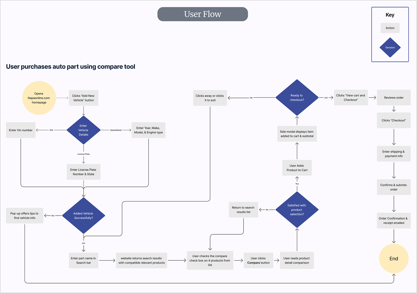
User Flow
There are multiple ways a user can search for a product, but it was important to focus on the one most likely to be used — the search bar. In this flow, the user adds a vehicle, searches for a part, selects 4 to compare, adds the chosen product to the cart and checks out. This flow gave our team a clear vision of the user path and the screens to design.
User Persona’s
User persona’s are integral to proper UX design as a way of keeping your target audience in mind. I created the attributes for the user persona “James Miller” who is a skilled DIY weekend mechanic. He regularly orders parts to keep both of his vehicles in tip-top shape. James represents all of our seasoned auto parts purchasers.

Design ideation
Low/Mid Fidelity
Following a common layout design pattern for e-commerce sites, I wanted to explore how a design layout would look if we stuck strictly to the color themes that we agreed on in the brand redesign.

Product Page
Grids are used to ensure
consistency in the layout design
Afinnity Mapping
Combining our findings from our team’s user interviews, we discovered that all of our interviewees shared the same desire in wanting to be able to compare prices, guarantee compatibility, and have clear vehicle compatibility information.
We also learned that VIN was the most accurate way to check product vehicle fit.
Our direction was to create a feature that would allow comparison between products
within the store.

Final Designs
Checkout Flow

